
 What Color Building Would You Prefer?
This was posted in August 2017. It is been posted again because the external color of Aquarius is again under discussion. This is a bit surprising because the color of the building was supposed to remain white after almost 150 votes in favor of maintaining like it is. The full white paint of the building was done in 2009.
It is time to paint the Aquarius exterior. For around 10 years we had it white. White like so many high-class building in the neighborhood. Just look at Beach Club, Apogee, Hyde, Diplomat Hotel and Diplomat Residence (not the Convention Center), Palms, Trump and so many others.
There are some residents that would like some color. Some would like it white.
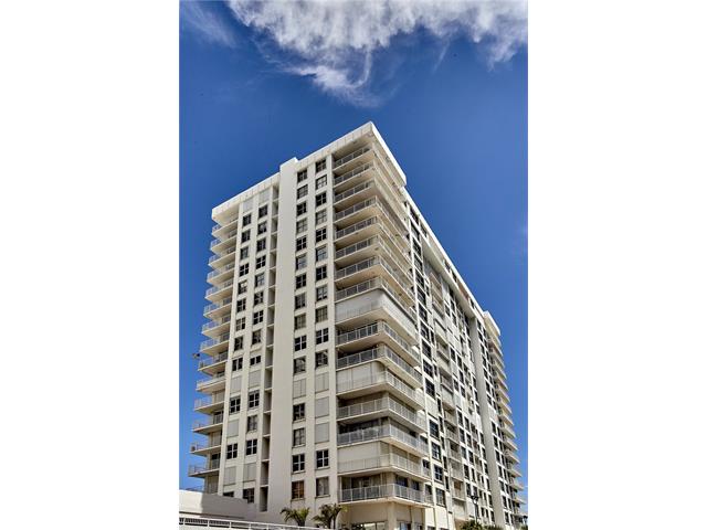
These two buildings down the street give a good idea of the contrast pure white versus color. They are 1701 and 1601 South Ocean Drive. Cambridge Towers and Oxford Tower. The Wellington is pure white with a very light blue accent from the glass balconies railings. Cambridge used several tonalite of beige, coffee, caramel with white windows and doors.

 What is nicer? Clean white and with the light accent of the glass balconies railings or color stripes? What is more modern, appealing and cleaner look? What of the is more classic looking, with a more conservative traditional view?
You are the judge.
Now lets see how Aquarius could look like.
Aquarius today. Full white. A more modern and clean look.

Aquarius in 1999. Used several colors predominantly dark gray and white showing a more conservative and seventies look.


The prior board was not legally allowed to change the white/gray color of the building to white since it was a material alteration. But board members typically do not know the rules and follow their own.
“Material alteration or substantial addition” means to “palpably or perceptively vary or change the form, shape, elements, or specifications…from its original design or plan, or
existing condition, in such a manner as to appreciably affect or influence its function, use, or appearance.” See Sterling Village Condominium, Inc. v. Breitenbach, 251 So. 2d 685,
687 (Fla. 4th DCA 1971) (where the court found that the replacement of a screen enclosure with jalousies was a material alteration).
So the color needs to be changed back to white and grey unless you get the required number of votes, like the balconies and the pool changes.
Since it appears to me that the balcony glass will be grey, then white and grey should be work well with the new balcony look.
LikeLike
I was here when the bldg was two tones of grey. It was ok. I love the look of the Diplomat Hotel. We have an aqua Ocean as our natural backdrop and I would LOVE to see some shades of aqua on our building . It looks beautiful and classy! Aqua and a light shade or white with aqua highlights is my choice!😊
LikeLike
I egry with Roni 100 percent
Apt 908 N
LikeLike
I agree with Roni Komie, we need an uplifting color, WHITE AND AQUA ARE BEAUTIFUL AND REFRESHING COLORS, GREY IS A VERY BORING DULL DEAD COLOR, WE NEED CONTRAST. I WOULD ALSO LOVE TO SEE AQUA COLOR GLASS ON OUR BACONY
LikeLike
I think that whit color of building will go very well with our dark glass balcony. . I will be elegant and classy.
LikeLiked by 1 person
I would prefer aqua glass on balcony’s and white color of the building, it would be bright, fresh and colorful elegant.
Alla Sapozhnikov
apt 406 N
LikeLiked by 1 person
I like the white with aqua accents
LikeLike
I would suggest to use a white color, thus it is a common trend these days.
LikeLiked by 1 person
Cecilio, it is quite obvious that you are recommending that the building remain white. It is your opinion that white is a cleaner more modern look. I respectfully disagree. There are many new buildings along Sunny Isles beach and Fort Lauderdale beach that are comprised of condominiums that cost many millions of dollars. Yet some of them have an accent color. The buildings that you chose to show the folks are Aquarius are not representative of a good highlight color or design. It would have been nice to show more buildings and not inject your opinion so forcefully. Just saying.
LikeLike
My preference is white, it looks clean and classy.
LikeLike
I hope it is not too late to change my opinion on a color I would like for our buildings, I recently noticed some Buildings that were painted in a light GREY, I loved it, The combination with the light grey(almost white) Glass of the Railings would be really beautiful,”in m opinion”
LikeLike